Dürer Farbanalyse
From DHVLab
Revision as of 20:10, 19 June 2016 by Wiki admin (talk | contribs)
Revision as of 20:10, 19 June 2016 by Wiki admin (talk | contribs)
# Duerer Color Analysis
# (c) 2016 Linus Kohl, kohl@munichtrading.com
# Question: Does Duerers useage of color change
# while and after his time in Venice (1505-1507)

#enable UTF-8 character encoding
options(encoding = "UTF-8");
#load database driver
library(RMySQL)
#other libraries
library(stringr)
library(zoo)
library(ggplot2)
library(data.table)
library(xts)
library(dplyr)

#set constants
#Duerer artist_id 2537
duerer_id <- 2537
# Duerer dates
duerer_birth <- 1471
duerer_death <- 1528
# Period in Venice 1505-1507
start_venice <- 1505
end_venice <- 1507
#connect to the database
mydb = dbConnect(MySQL(),
                 host='db.dmz.dhvlab.fo',
                 user='devel_ro',
                 password='XXX',
                 dbname='XXX'
)

#define query string to get average nr of distinct color areas
qs_nr_areas <- str_replace_all(sprintf("
    SELECT date_mean dating, AVG(nr_areas) as nr_areas
    FROM artworks as aw
    LEFT JOIN artworks_colors as ac
    ON aw.id = ac.artwork_id
    WHERE aw.artist_id = %d AND
          aw.date_mean > %d AND
          aw.date_mean < %d
    GROUP BY date_mean
    ORDER BY dating", duerer_id, duerer_birth, duerer_death), "[\r\n]" , " ")

#query database
data_nr_areas = dbGetQuery(mydb, qs_nr_areas)
#fill missing values
#create complete sequence over dates
all_dates <- seq(from = min(data_nr_areas$dating), to = max(data_nr_areas$dating), by = 1)
table_all_dates <- data.table(dating=all_dates)
#merge tables
merged_sequence <- merge(data_nr_areas, table_all_dates, by="dating", all=TRUE)
#plot
plot(merged_sequence$dating, na.approx(merged_sequence$nr_areas), type="s", xlab="Date", ylab="Average nr. Areas")
#add lines for stay in Venice
abline(h = start_venedig, v = start_venice, col = "red")
abline(h = end_venedig, v = end_venice, col = "red")
#DataSet before Venice
nrAreasBefVenice <- subset(data_nr_areas, dating < start_venice)
#DataSet in Venice
nrAreasInVenice <- subset(data_nr_areas, dating >= start_venice & dating <= end_venice)
#DataSet after Venice
nrAreasAftVenice <- subset(data_nr_areas, dating > start_venice)

#print averages
print(sprintf("Average Nr Areas before Venice: %f", mean(nrAreasBefVenice$nr_areas)))
print(sprintf("Average Nr Areas in     Venice: %f",mean(nrAreasInVenice$nr_areas)))
print(sprintf("Average Nr Areas after  Venice: %f",mean(nrAreasAftVenice$nr_areas)))


#analyze colors
qs_colors <- str_replace_all(sprintf("
    SELECT aw.date_mean dating, ac.color, AVG(ac.nr_areas) as avg_nr_areas, AVG(ac.perc_areas) as avg_perc_areas
    FROM artworks as aw
    LEFT JOIN artworks_colors as ac
    ON aw.id = ac.artwork_id
    WHERE aw.artist_id = %d AND
          aw.date_mean > %d AND
          aw.date_mean < %d
    GROUP BY ac.color, dating
    ORDER BY dating", duerer_id, duerer_birth, duerer_death), "[\r\n]" , " ")
#query database
data_colors = dbGetQuery(mydb, qs_colors)

#get color names
color_names <- data.table(color = c("green", "red", "black", "blue", "orange", "violet", "yellow", "white"))
#create sequence of all years
all_dates <- data.table(dating = seq(from = min(data_colors$dating), to = max(data_colors$dating), by = 1) )
#create cartesian product of years and colors
merge_table <- data.table(CJ(dating = all_dates$dating, color = color_names$color))
#set primary key to dating and color
setkey(merge_table, dating, color)
#convert result to data.table
dc <- data.table(data_colors)
#set primary key to dating and color
setkey(dc, dating, color)
#add years that have no artwork available to the dataset with NA values
data_colors <- merge(dc, merge_table, by=c("dating", "color"), all=TRUE, allow.cartesian = TRUE)

#split colors
white  <- subset(data_colors, color=="white")
black  <- subset(data_colors, color=="black")
red    <- subset(data_colors, color=="red")
orange <- subset(data_colors, color=="orange")
yellow <- subset(data_colors, color=="yellow")
green  <- subset(data_colors, color=="green")
blue   <- subset(data_colors, color=="blue")
violet <- subset(data_colors, color=="violet")


png('duerer/white.png')
plot(white$dating , white$avg_perc_areas, type="l", lty=2, xlab = "Year", ylab="Percentage", ylim=c(0, 100))
abline(h = start_venedig, v = start_venice, col = "red")
abline(h = end_venedig, v = end_venice, col = "red")
dev.off()

png('duerer/black.png')
plot(black$dating , black$avg_perc_areas, type="l", col="black", xlab = "Year", ylab="Percentage", ylim=c(0, 100))
abline(h = start_venedig, v = start_venice, col = "red")
abline(h = end_venedig, v = end_venice, col = "red")
dev.off()

png('duerer/red.png')
plot(red$dating , red$avg_perc_areas, type="l", col="brown2", xlab = "Year", ylab="Percentage", ylim=c(0, 100))
abline(h = start_venedig, v = start_venice, col = "red")
abline(h = end_venedig, v = end_venice, col = "red")
dev.off()

png('duerer/orange.png')
plot(orange$dating , orange$avg_perc_areas, type="l", col="darkorange", xlab = "Year", ylab="Percentage", ylim=c(0, 100))
abline(h = start_venedig, v = start_venice, col = "red")
abline(h = end_venedig, v = end_venice, col = "red")
dev.off()

png('duerer/yellow.png')
plot(yellow$dating , yellow$avg_perc_areas, type="l", col="gold", xlab = "Year", ylab="Percentage", ylim=c(0, 100))
abline(h = start_venedig, v = start_venice, col = "red")
abline(h = end_venedig, v = end_venice, col = "red")
dev.off()

png('duerer/green.png')
plot(green$dating , green$avg_perc_areas, type="l", col="chartreuse", xlab = "Year", ylab="Percentage", ylim=c(0, 100))
abline(h = start_venedig, v = start_venice, col = "red")
abline(h = end_venedig, v = end_venice, col = "red")
dev.off()

png('duerer/blue.png')
plot(blue$dating, blue$avg_perc_areas, type="l", col="mediumslateblue", xlab = "Year", ylab="Percentage", ylim=c(0, 100))
abline(h = start_venedig, v = start_venice, col = "red")
abline(h = end_venedig, v = end_venice, col = "red")
dev.off()

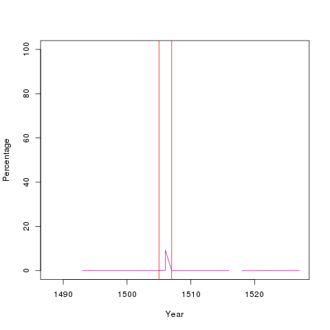
png('duerer/violet.png')
plot(violet$dating , violet$avg_perc_areas, type="l", col="mediumvioletred", xlab = "Year", ylab="Percentage", ylim=c(0, 100))
abline(h = start_venedig, v = start_venice, col = "red")
abline(h = end_venedig, v = end_venice, col = "red")
dev.off()

analytics <- data.frame(stringsAsFactors = TRUE)
for (col in color_names$color) {
    b <- subset(data_colors, dating < start_venice & color == col)
    i <- subset(data_colors, dating >= start_venice & dating <= end_venice & color == col)
    a <- subset(data_colors, dating > start_venice & color == col)

    new_row <- data.frame(color=col,
                          before_venice = mean(b$avg_perc_areas, na.rm=TRUE),
                          in_venice = mean(i$avg_perc_areas, na.rm=TRUE),
                          after_venice = mean(a$avg_perc_areas, na.rm=TRUE), stringsAsFactors=FALSE)
    analytics <- rbind(analytics, col = new_row)
}
rownames(analytics) <- analytics$color
analytics$color <- c()
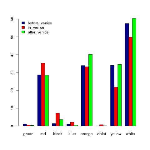
png('duerer/distribution.png')
colors <- c("darkblue", "red", "green")
barplot(t(as.matrix(analytics)), beside=TRUE, col = colors)
legend("topleft", colnames(analytics),  fill = colors, bty = "n")
dev.off()

